
+86-15726853660 / +86-18301913645
+86-15726853660 / +86-18301913645
Soft color palettes have quietly reshaped the look of many products and spaces. Walk into a retail store, open a piece of packaging, or look at modern furniture, and you may notice a shift toward gentle tones. These shades do not demand attention. They create a mood instead. Within this movement, macaron color PVC film has found a clear place.
It is not a new material in itself. What has changed is how it is presented and used. The surface, the color story, and the feeling it brings all play a role. The rise of this material reflects a broader change in design thinking, where calm visuals and subtle textures often matter more than bold contrast.
Macaron PVC film is a decorative surface layer made in soft, pastel tones. The name comes from the colors of macarons, which are known for their light and balanced shades. These colors include pale pink, soft blue, light green, and muted yellow.
The film is applied to a base surface, often through heat or pressure. Once attached, it forms a smooth outer layer that combines color and protection. It can be used on flat panels or shaped surfaces, depending on how it is processed.
What makes it stand out is not the material alone, but the way color is handled. The tones are controlled to appear calm and even. They do not create sharp contrast. Instead, they blend into the surrounding space.
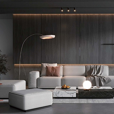
Design preferences tend to move in cycles. Bright and bold styles often give way to something quieter over time. At present, many designers and consumers are drawn to environments that feel relaxed.
Soft colors help create that effect. They reflect light in a gentle way and reduce visual tension. In living spaces, they can make rooms feel more open. In products, they give a sense of ease without adding complexity.
There is also a shift toward emotional design. People pay more attention to how objects make them feel. A surface that looks calm can influence the overall experience of a product. Macaron PVC film fits naturally into this direction.
Traditional PVC films often focus on strong colors or high contrast patterns. They may aim to stand out or imitate bold natural textures.
Macaron PVC film takes a different approach. It reduces intensity and focuses on balance. The surface may still have a pattern, but it is usually subtle. The goal is not to dominate attention but to support the overall design.
Texture also plays a part. Many of these films are made to feel soft or smooth to the touch. This adds another layer to the user experience.
| Feature Aspect | Traditional PVC Film | Macaron Color PVC Film |
|---|---|---|
| Color style | Bold or high contrast | Soft and pastel |
| Visual effect | Strong presence | Calm and balanced |
| Surface feeling | Standard finish | Gentle or smooth touch |
| Design role | Attention-focused | Atmosphere-focused |
Its use spreads across several areas, often where visual comfort is important.
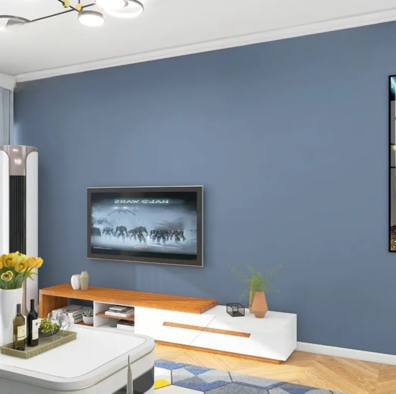
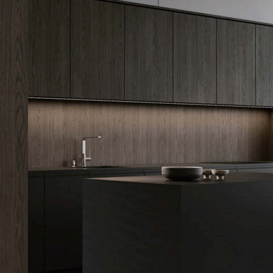
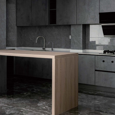
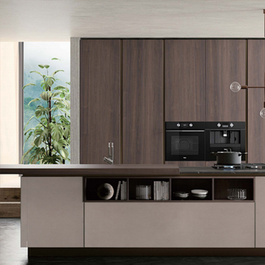
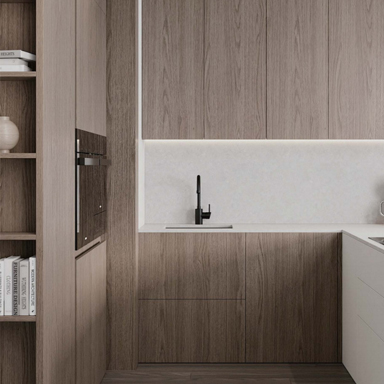
In furniture, it appears on cabinet doors, shelves, and panels. The soft colors make large surfaces feel less heavy. This is useful in smaller spaces where strong colors might feel overwhelming.
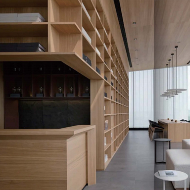
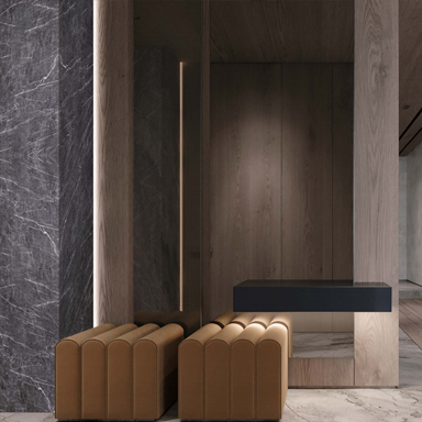
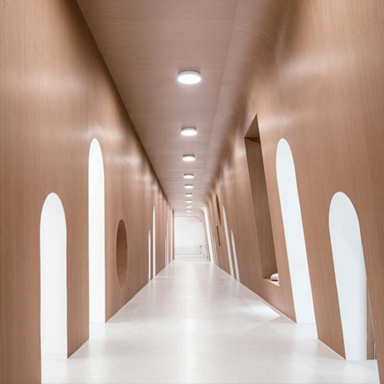
Interior decoration also makes wide use of it. Wall panels, partitions, and decorative trims can carry these tones. They help create a consistent look across a room.
Packaging is another area where the film shows up. Products aimed at lifestyle markets often use pastel colors to create a friendly image. The surface finish adds a sense of care and detail.
Retail displays benefit as well. Soft tones allow products to stand out without competing backgrounds. The display feels organized and easy to view.
The look of a product often shapes how people respond to it. Even before use, the surface sends a message.
Macaron PVC film tends to suggest calmness and simplicity. It does not feel aggressive or overly styled. This can make products appear more approachable.
There is also a sense of consistency. The even color tone reduces visual noise. When used across multiple items, it helps create a unified collection.
In some cases, the material can make a product seem lighter, even if its structure has not changed. This effect comes from the way soft colors interact with light and shadow.
Color is only one part of the story. Texture adds another dimension.
A smooth surface can enhance the softness of pastel tones. It allows light to spread evenly, which supports the calm effect. Some finishes may feel slightly matte, reducing glare and making the surface easier on the eyes.
Touch also matters. When a surface feels gentle, it reinforces what the eye sees. This connection between visual and physical experience is often discussed in design circles.
Manufacturers pay attention to how the film behaves during handling. A consistent surface without visible marks helps maintain the intended look.
Designers often look for materials that can adapt to different styles. Macaron PVC film offers that flexibility.
It can work in modern interiors, where simplicity is valued. It can also fit into more playful settings, especially when combined with other soft elements.
Another reason is ease of coordination. Pastel tones tend to pair well with neutral colors and natural materials. This makes it easier to build a complete design without strong clashes.
The material also supports repeat production. Once a color tone is set, it can be applied across many pieces with similar results. This consistency is useful in larger projects.
Working with softer tones brings its own set of challenges.
Color consistency can be more noticeable. Small differences may stand out more than they would in darker shades. This requires careful control during production.
Surface cleanliness is another point. Light colors can show marks more easily. Handling and storage need attention to avoid visible flaws.
Application also needs precision. Any uneven bonding may be easier to see on a smooth, pale surface. This means the process must be stable from start to finish.
These challenges do not limit the material, but they shape how it is handled in practice.
Macaron color PVC film does not exist in isolation. It reflects wider movements in design and manufacturing.
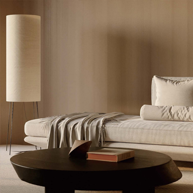
There is a growing interest in materials that feel calm and balanced. This applies to both living spaces and everyday products. People often look for environments that reduce stress rather than add stimulation.
There is also a focus on subtle detail. Instead of strong decoration, designers explore small changes in color and texture. These details build a quiet sense of quality.
The trend also connects to lifestyle shifts. As work and personal space overlap more, the need for comfortable surroundings increases. Materials that support a softer visual tone naturally gain attention.
At the same time, production methods continue to adapt. Manufacturers explore ways to maintain consistency while meeting changing design demands. The material evolves with these needs, finding new roles without losing its core function.
Contact us
+86-15726853660 / +86-18301913645
No. 99, Jinxiang Road, Hubin New District, Suyu, Suqian City, Jiangsu Province, China
Decorative Film Materials

 English
 Français
 Español
 عربى
عربى
 русский


